Page Measurement & Layout
Pixel rulers, design-grid overlays, breakpoint guides, an X-Ray view of every element on the page, and a built-in responsive viewport for testing at device sizes.
Page Rulers
Page rulers are persistent guide lines that span the top and left edges of the viewport, marked off in pixels. A live crosshair tracks your cursor and shows its exact X and Y coordinates against the rulers in real time.
Rulers use a three-tier tick scheme: minor ticks every 10 pixels, medium ticks every 50, and major ticks every 100 with numbered labels. Fine enough to spot single-pixel misalignments, coarse enough to navigate large layouts.
Especially useful for checking alignment between elements that aren’t adjacent in the DOM. Drop the crosshair on the left edge of one element, read its X coordinate, then move to another element on the same column to confirm they line up.
Layout Grid Overlay
Drop a fully configurable column grid on top of any webpage to verify alignment with a design system’s grid. It uses real CSS Grid (grid-template-columns: repeat(N, 1fr)) under the hood, so the columns track the viewport perfectly and respect everything you’d expect: max-width constraints, gutters, page margins.
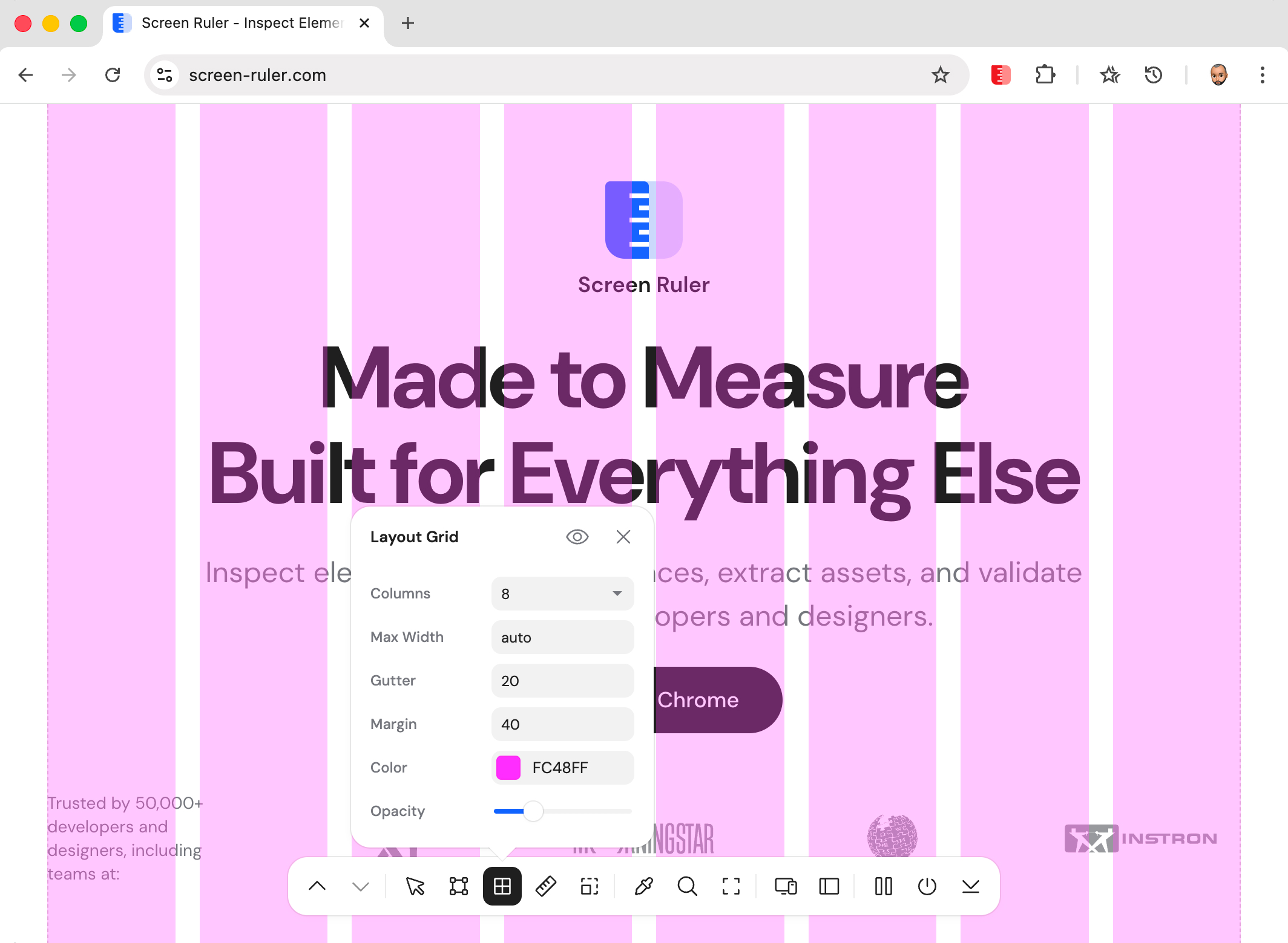
Column count options are 2, 3, 4, 6, 8, 12, or 16. Defaults: 8 columns, 20 px gutter, 40 px margin, magenta (#FC48FF) at 30% opacity. Settings persist across page reloads.
Breakpoints
The breakpoints tool scans every accessible stylesheet on a page, extracts min-width and max-width values from @media rules, and draws cyan vertical guide lines at each breakpoint. Stop guessing where responsive layouts snap and see them.
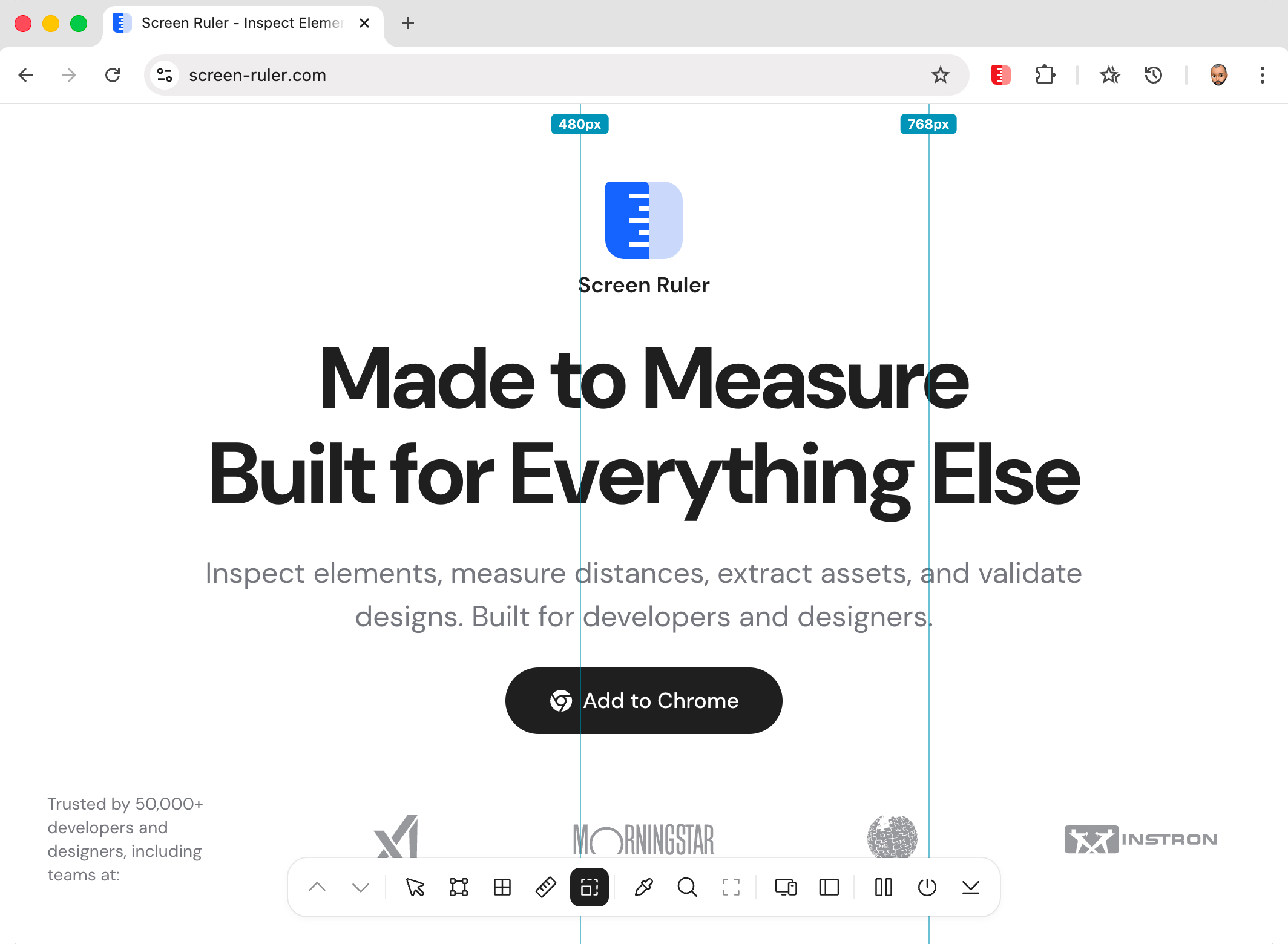
@media values. em and rem values are normalised to pixels using the page’s root font size.Active media queries are evaluated against the current viewport via window.matchMedia(), so you only see breakpoints the page actually treats as live. Cross-origin stylesheets the browser blocks are skipped silently.
X-Ray Mode
X-Ray Mode draws an outline around every element on the page simultaneously, with colours that cycle by nesting depth. Top-level elements get one colour, their children get another, grandchildren a third, and so on, eleven levels deep. The result is a wireframe view of the page’s structure overlaid on its visual design.
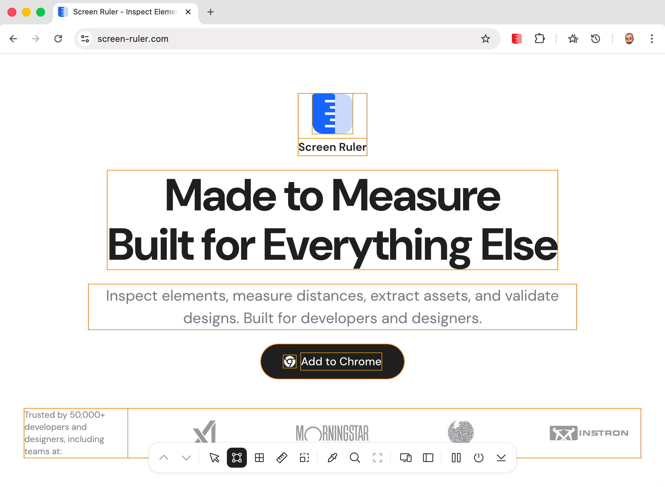
It’s a debugging tool you reach for the moment something feels off and you can’t see why. Stretched layout? Mystery margin? Phantom click target? Toggle X-Ray and the answer is usually obvious in two seconds.
Responsive Mode
Preview any webpage at iPhone, iPad, Galaxy, and custom device viewports without leaving the tab. A toolbar at the top of the page gives you a device preset dropdown, editable width and height inputs, a rotate button, and a zoom selector.
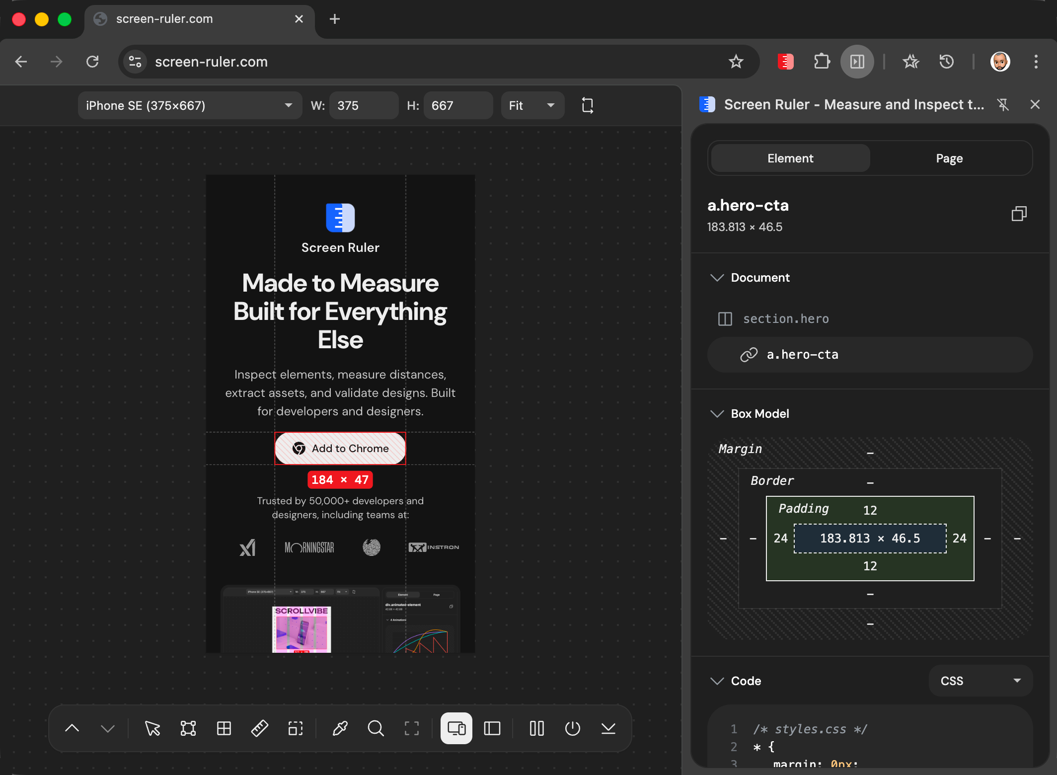
Built-in presets cover modern phones (iPhone SE through iPhone 17 Pro Max, common Android sizes) and tablets (iPad Mini, Air, Pro 11″, Pro 12.9″, Galaxy Tab). Custom dimensions accept any value from 320 to 3840 px. Zoom levels: Fit (auto), 50%, 75%, 100%, 125%, 150%. Click rotate to swap width and height.